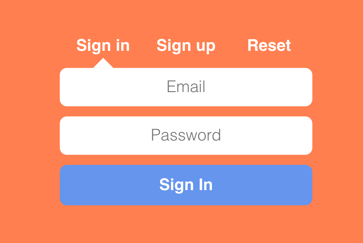
This Animated Signin/Signup form allows users to navigate between login/signup to get into your website. The user can easily switch from one form to the other, or select the reset password option.
SOURCE CODE DOWNLOAD

For Demo & Source Code Scroll down.
#Creating the structure with HTML Markup
    <div class="flex-wrap">
      <fieldset>
        <form action novalidate>
          <input type="radio" name="rg" id="sign-in" checked />
          <input type="radio" name="rg" id="sign-up" />
          <input type="radio" name="rg" id="reset" />

          <label for="sign-in">Sign in</label>
          <label for="sign-up">Sign up</label>
          <label for="reset">Reset</label>

          <input
            class="sign-up sign-in reset"
            type="email"
            placeholder="Email"
          />
          <input
            class="sign-up sign-in"
            type="password"
            placeholder="Password"
          />
          <input
            class="sign-up"
            type="password"
            placeholder="Repeat Password"
          />
          <button>Submit</button>
        </form>
      </fieldset>
    </div>
For multi functionality form, we created <div> & <fieldset> inside them form will build & will work when user click on any appropriate option such as Signin, Signup or Reset Password. Whole working is made by using only CSS without use of any JavaScript.
#Adding style
As default, Signin will be active & all other options are hidden & will get active when user will click on any given option.
Field will active on their appropriate option on basics of class="sign-up sign-in reset" each option is divide on these class basis. If user click on Reset Password option then only Email field will be shown & other fileds will be disabled, This will work on the basis of Class define with the option such as with Reset Password class="sign-up" is defiend.
When you clicked on any option either is signin or signup. Button text will also change through CSS. Below CSS code is used to change text on Button everytime when user click on any options.
[id="sign-in"]:checked ~ button:before {
  content: "Sign In";
}

[id="sign-up"]:checked ~ button:before {
  content: "Sign Up";
}

[id="reset"]:checked ~ button:before {
  content: "Reset password";
}
To point active option, We used cutom tooltip to point out the selected option.
label {
  position: relative;
  display: inline-block;
  text-align: center;
  font-weight: 700;
  cursor: pointer;
  color: white;
  -webkit-transition: 300ms ease;
  transition: 300ms ease;
  width: calc(100% / 3 - 4px);
}
  label:after {
  content: "";
  border: 10px solid transparent;
  position: absolute;
  bottom: -10px;
  left: calc(50% - 10px);
  -webkit-transition: inherit;
  tr
[id="sign-in"]:checked ~ [for="sign-in"]:after,
[id="sign-up"]:checked ~ [for="sign-up"]:after,
[id="reset"]:checked ~ [for="reset"]:after {
  border-bottom-color: #fff;
}
You will get all files, when you
download the source code. And
after than you can edit it according to you
if you face any issues you can
contact by asking
question with article link.
You can go through Demo as well
as Download source code for the
same & make changes according to you


